

MINE Vienna | Branding & Web Design
MINE Vienna by Nina Gärtner
Branding | Web Design
Founded by Nina Gärtner in 2024, Mine Vienna is a haven of preventative care for both adults and children, fostering balance and self-care through creative courses and yoga. As a dedicated teacher, Nina discovered that prevention is the cornerstone of holistic health. After her own health battles, she realised the paramount importance of proactive care rather than merely reacting to issues.
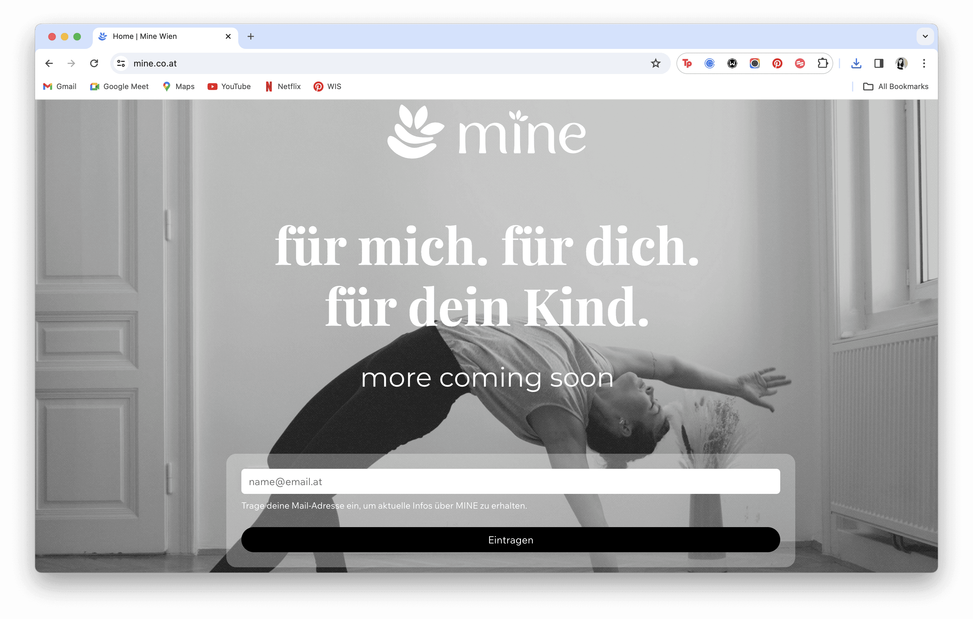
House of Five Studio is proud to have partnered with Mine Vienna to create their visual branding and website, bringing their vision to life and supporting Nina in starting her first business.
Behind the Brand
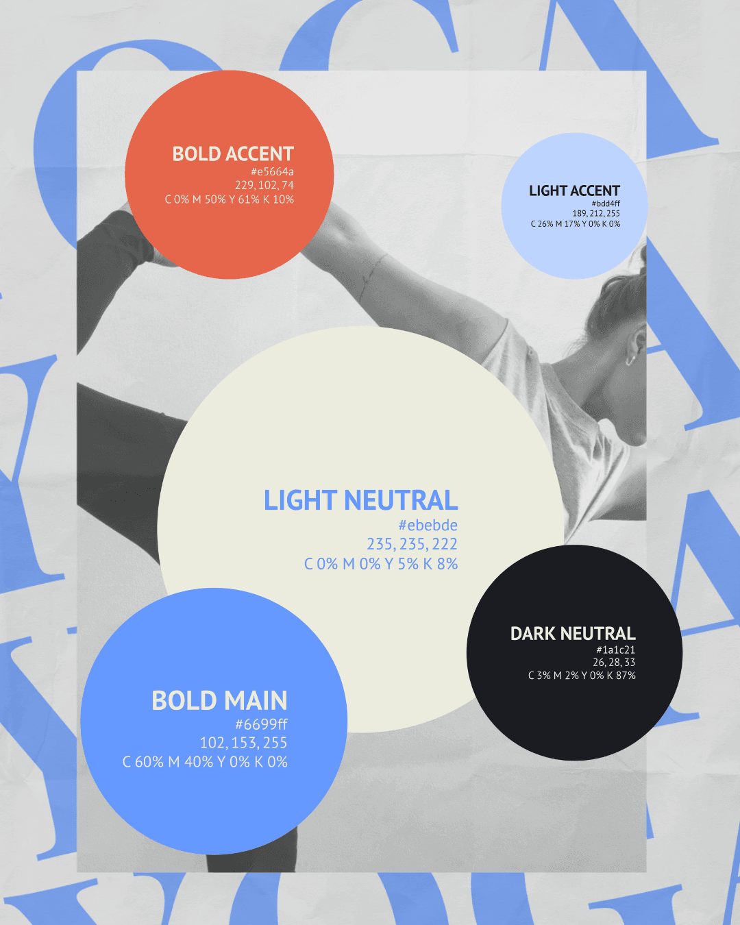
Colours
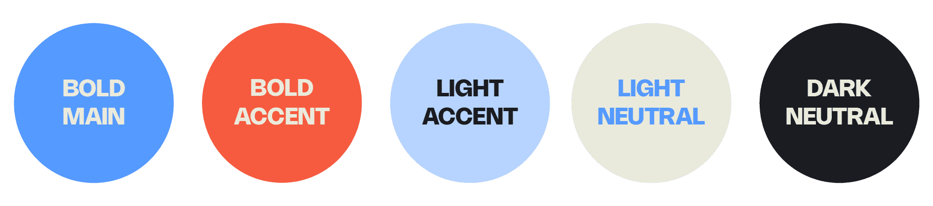
The colour palette for Mine Vienna was meticulously curated to evoke a sense of calm, inclusivity, and strength, resonating with the brand's mission to cater to individuals and families alike. Each colour was chosen to complement the brand's values and aesthetic. The two accent colours, coral and blue, serve as the colours representing each of the services Mine is offering - blue for yoga and coral for creative courses.
The striking blue is the primary colour used in the brand's identity. This shade embodies trust, stability, and professionalism, qualities that are essential to the brand's image. It conveys a sense of reliability and confidence, reassuring the audience of the brand's dedication to quality and care.
The vibrant shade of coral serves as a dynamic and energetic highlight within the brand's visual identity. The warm tone of coral adds a touch of vitality and enthusiasm, reinforcing the brand's commitment to promoting an active, creative, and healthy lifestyle.
The soft, pastel blue, brings a sense of tranquillity and calm to the brand's palette. This colour is utilised in backgrounds and secondary elements to create a soothing and inviting atmosphere. The light blue evokes feelings of openness and serenity, aligning with Mine's goal of providing a peaceful and nurturing environment for its community.
The light neutral colour is a delicate, off-white shade that serves as the foundation of our palette. This versatile colour is used extensively across various touchpoints to maintain a clean and modern aesthetic. The neutral tone reflects simplicity and purity, key aspects of Mine Vienna's brand ethos.
The dark neutral colour, a deep charcoal, adds depth and contrast to the palette. This colour is used for text and other important details, ensuring readability and clarity. The dark hue provides a sophisticated and elegant touch, balancing the lighter tones in the palette. It signifies strength and resilience, attributes that are core to Mine's identity.
By combining vibrant accents with calming neutrals, we have crafted a palette that is both inviting and professional, perfectly reflecting the brand's commitment to supporting and enriching the lives of its community members.
Font pairing

With the chosen typography, we wanted to ensure a perfect balance between elegance and readability. The selected fonts - Playfair Semibold for titles and subheaders, and Montserrat Light for body text - complement each other to create a cohesive and visually appealing brand identity.
The combination creates a striking contrast that enhances the visual hierarchy of the content. Playfair Semibold draws attention to key headings and subheaders, while Montserrat Light ensures that the body text is legible and unobtrusive. This font pairing reflects Mine Vienna's dedication to both elegance and functionality, reinforcing the brand's identity as both professional and approachable.
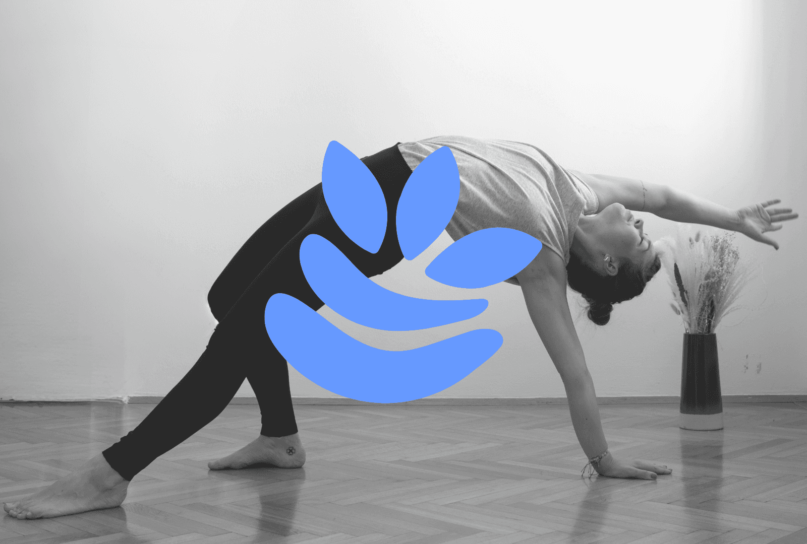
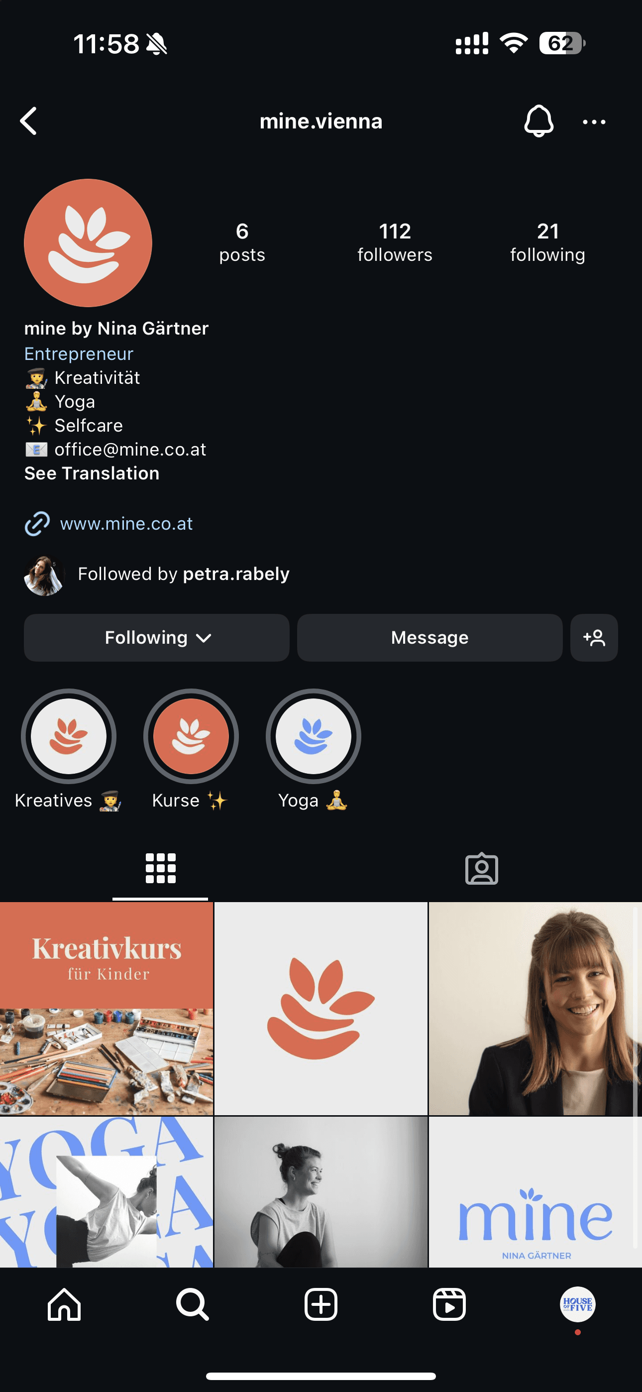
The logo and its symbolism
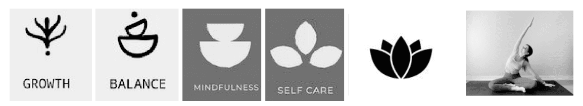
The logo draws inspiration from multiple well-known symbols of the wellness industry. Its slightly tilted shape follows a yoga pose called Parsva Sukhasana, also known as a seated side bend. Additionally, we incorporated a lotus flower—a motif that Nina has as a tattoo—symbolising rising from a dark place into beauty and rebirth.

"House of Five supported me since day 1 of building up my own business. As a sole proprietor with no special knowledge and experience of building up an own business including designing websites, and marketing. I was really happy to work with House of Five! They listened to me, helped me define my business goals and next steps (short- and long-term), designed a perfect logo for me, built up my homepage and did so much more. I recommend all their services, their professional way of working with people always focussing on the dreams and visions of their clients. You are great! Thanks for everything!"
